Thursday, December 31, 2009

Should the US have More Say at the IMF?

The United States is typically believed to have too large a presence in global financial and military institutions. Former World Bank Chief Economist Joseph Stiglitz criticized the IMF for being too much a tool of the Washington Consensus during the Asian financial crisis. The Fund itself built its massive (and highly secured) headquarters only blocks from the White House. Yet for all its influence, a new report by the Congressional Research Service makes the US look more like underrepresented China than like EU powers.

The figure below charts the proportion of IMF votes against a country’s share of global GDP.

According the CRS report, the US “is unlikely to lose voting power in the negotiations, as the United States is actually an under-represented country at the IMF. The United States chose to allow its proportional share to decline in recent decades, partly to make room for new members and partly to lower its financial obligation.”

I’ve written about IMF voting shares previously and shown the US is by no means lacking representation. Under a move this year to allow the IMF to respond to the current crisis by selling some gold, the US still has 16.73 percent of all IMF votes. That’s the largest share to any single country and more than twice the 6.23 percent of votes given to Japan the second most prominent country. Additionally, the so-called BRIC (Brazil, Russia, India, and China) developing countries make up only 10.26 percent of IMF votes. That’s a large share but it still leaves the US as the dominant power.


Nor is global GDP really the relevant measure. IMF votes are assigned proportionately to contributions to IMF funds, not to global output. In other words, the US’s official position in global financial institutions has more to do with our level of involvement than with superpower status. As measures to reform global finance in the wake of the crisis, staying involved should be a priority.

Wednesday, December 30, 2009

The New GM Theory

I haven’t written about the auto bailout in sometime. I mostly skipped writing about Cash for Clunkers. I’ll say now that the program appears to have increased the price of used cars by scrapping many of the clunkers. Americans who decried bailouts to risk taking banks sadly saw little resemblance to having their investments in their cars propped up to the disadvantage of first time car buyers.

But Cash for Clunkers, which cost about $2.8 billion, looks about as expensive as Goldschlager looks gold-dense when compared to the funds given to auto companies directly. The first annual report of the Office of Financial Stability shows that the US government still has almost $15 billion in loans out to Chrysler, GM, and GMAC. The figure below shows how these loans were converted into government ownership of Chrysler and GM.

Now the government at least bought into GM near a historic low point for the company, so any uptick could generate some returns but the company’s ownership has been radically reorganized. Chrysler will face challenges from being majority-owned by VEBA, a representative of employees and their pension funds. GM faces a less clear future being owened largely by governments that say they don't want to own auto companies. Further complicating GM is that the company is co-owned by the American and Canadian government.
Now let’s think this through. We now have a large firm, with high fixed costs, a lagged cycle for innovation and high costs to making one year of bad products, owned by multiple governments, facing tough international competition. I think I’ve seen this game before, in fact I think applying it to Airbus helped win Paul Krugman a Nobel Prize. Yet the now classic Boeing-Airbus game doesn’t say that governments should dump their corporate investments but should instead encourage domestic production in such markets.

Thursday, December 17, 2009

The Tax that Wasn't

I've got a post over at the Enterprise blog today on the Social Security earnings test. I'm propsing the unconvential approach that misunderstanding about the test could actually cause people to work longer.

Wednesday, December 16, 2009

Balancing Act


The Federal Open Market Committee just released its policy statement. No major surprises here. The Federal Funds Rate is staying in its 0 to .25 range. For some time I’ve been using the compare function of MS Word to track the changes in the FOMC’s statements. The function which is meant to find revisions in updated versions of the same document works surprisingly well for the FOMC. In other words, there are not a whole lot of changes between statements. The minimalist approach means that I’m going to each change got Joyciean attention (James Joyce was rumored to have ceased writing for days simply to fixate on one word that he wanted to get right).

So here are this month’s changes. The Fed is
1. Shifting the winding down of the MBS purchases into the present tense.
2. Says firms are “reluctant to hire” rather than the active cut backs from last month.
3. Eliminates the phrase “the fed is monitoring the size and composition of its balance sheet”
4. Has reaffirmed its commitment to end most of its special programs by February 1, 2010.

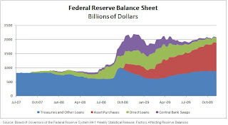
I’m still watching the balance sheet, given that, as the chart above shows it’s still double the size that it was before the crisis began. Additionally, it's the red section of the chart, direct asset, purchases that is growing and likely carries the most risk. Just as Treasury has called the Capital Purchase Program closed even while sitting on nearly $100 billion of potentially toxic assets, the Fed may be stuck with a good deal of garbage for a long time.

Wednesday, December 2, 2009

New York, Unequal New York

This morning, Felix Salmon of Reuters pointed out an “income barbell” on Manhatten and some of its boroughs. The post begins:

Did you know that there are more rich households (anything over $192,000 a year for a family of four) in Bay Ridge than there are on the East Side south of 14th Street?

Salmon’s post draws on a mapping application from Envisioning Development.

I’ve never been to Bay Ridge and my time in New York City is only cursory. I actually noted the post mostly because of the great work being done in that neighborhood by a Columbia J-School student.

But from the Envisioning Development data, I was able to test just how much of a barbell there is in any New York neighborhood. For the reasons above, I’ve picked Bay Ridge as a test case. The EV map provides a number of people in various income ranges for each neighborhood. For instance, the Bay Ride data says that 5,595 middle income families, who earn between $61,000 to $91,000, live in the neighborhood. The EV data also reports that the median income in the neighborhood is $65,800* or 85 percent of the citywide median. The distribution is called a “barbell” due to the large number of people near the bottom and the top.

Yet it turns out that the barbell in Bay Ridge is not really much different from the national average. I drew this conclusion by simulating the distribution of Bay Ridge’s income form the EV data. I created a random sample of families with income distributions the same as the EV data. Since the EV data only provides a range of incomes, I’ve assumed that any income value within a given range is equally likely. The other assumption used in my analysis is to top code the income distribution at $325,000.&

I’ve compared my analysis to a common metric of income inequality, the Gini Coefficient. Gini values close to zero indicate equal income across a population and Gini values close to one are more unequal.

According to the Census Bureau the national Gini index was .461 in 2007. I’ve produced a value of about .42, on average for multiple iterations, of the simulation.

Below is the Lorenz Curve, the graphical representation of Gini, for a single iteration of the sample.

*My simulated cohorts produce a similar value.& Public Use Micordata released by the Census Bureau typically top codes at $250,000. I’ve used a higher value to account for the smaller than usual sample size.

Sunday, November 22, 2009

Forget the Phantoms, the Real Districts are Behind

Much attention was paid last week the errant phantom districts created by the federal administrators of the stimulus bill. Online policy watchers at Watchdog.org have done a good job of counting the 30,000 jobs “created or saved” in 440 phantom districts created by coding errors.

Since then the top level information on the Recovery.gov website has been changed so that districts are now compiled as “unassigned congressional district.” The errors remain in the downloadable data files.

The phantom districts don’t really matter, except that they undermine the data. These simple code errors reveal a lack of oversight. As Ed Pound, director of communications for the Recovery Accountability and Transparency board, told Watchdog, “Our job is data integrity, not data quality.”

It’s this lack of attention that allows for massive over-reporting from Georgia to Colorado, to name a few. These repeated errors cast doubt upon the entire dataset.

Most economists will tell you that Congressional district is a terrible breakdown for job analysis. The choice to mandate such reporting the stimulus bill was likely more to garner bragging rights about local job generation. While low in economic meaning, those numbers could be powerful talking points next November. Despite potential inflation, most districts have not made surprisingly large job gains.

When the stimulus bill was being debated, district by district job creation estimates were created based on a wider analysis by CEA Chairwoman Christina Romer and Jared Bernstein. Those estimates were for the full two years after passage and most districts are far from reaching the predicted levels. Yet 16 districts have already surpassed their two year creation expectations. Of the 16, 13 are represented by Democrats, most notably; California’s 5th district in Sacramento and represented by Representative Doris Matsui (D) has already produced 12 times as many jobs as predicted. Even without those outliers, Republican districts report on average 521 jobs compared to the average 679 reported in Democratic districts. Of course, it could be a phantom difference.

Monday, November 16, 2009

Be prepared to work more

The Federal Reserve Bank of Philadelphia released its forth quarter suvery of forecasters today. The survey predicts that economic growth will be stronger than expected in coming years and that unemployment will be higher compared to last quarter's survey. Those two factors combined are likely to mean more work for those Americans who are working.

The basic conception of national output (Y) is usually given as Y=f(K, AL). This means that output is a function of capital (K) and labor (L) with a multiplier for technological advancement (A). The new Philadelphia numbers indicate that L is going to continue to decline for some time. The capital stock, K, seems unlikely to rise anytime soon. As the figure below shows non-defense capital goods orders have declined drastically this year. While the figure appears to be leveling off, it will likely take some time to regain lost levels.

This leaves A to drive growth. Increases in A are by no means synonymous with more work. During the tech bubble A increases were the result of things like e-mail and internet access. In the present recovery, the growth is likely to come from one place: hours 1. Of course hourly increases are not going to be distributed evenly. The average workweek for nonsupervisory production works is 33 hours a week, its lowest level since WWII. That of course is linked to the lower panel shown above, with lots of unfilled orders businesses just are not producing right now.
The situation may not be all bad news. The New Yorker ran a story in March that those who are working are seeing steady wage increases. Plus research out this year indicates that it’s the un- and under-employed who are the most likely to experience depression. Happy work hours.

1. We could of course think of more hours as an increase in L. I’ve eschewed that here so as to separate out the impact of number of people employed and work per person employed.

Sunday, November 15, 2009

More Marathon analysis

Several weeks ago I posted upon the results of a half marathon that I recently ran. Since then, the marathon season has run it's biggest races of the fall, including Chicago, New York, and DC's Marine Corps. I haven't had the pleasure of running any of these trials (I'm hoping for a debut next fall). I've been encouraged to see that more analysis has come from watching those races.

One of the most past along was this post by Paul Kedrosky of Infectious Greed asking why the wining finish times at New York have been less volatile overtime. The post provides a great question with little answer. I've discussed this disparity with several runners (including one who finished in the top 400 males runners at Boston this year) and several hypothesis have struck us.

I. Weather. The New York and Boston marathons are run at different times of the year and weather maybe in more flux in the Boston spring than the New York fall.
II. Competing Races. The New York marathon competes with Chicago, DC, and Detroit for runners. Boston competes with London, in 2010 the two are a week apart. As a result New York may attract a wider international field and Boston may have a more American appeal.
III. Prize money disparity. I've checked and this explanation seems unlikely. Boston paid out$150,000 to winning runners and New York paid out $130,000 to winners. Unless the evolution of the two races' prizes has been different, I'd expect that Boston with the higher prize would have less volatile times as it should consistently attract top talent.

Analysis of this type is a test, evaluate, and reject kind. There are lots of possible reasons but probably only a few that hold up to rigorous analysis.

Speaking of rigor, I've done a bit more work on the half-marathon I ran and owe readers an update. I originally provided a simple linear regression on gender and age. I tested other specifications and did not get any more significant explanitory power. Well, at least not statistically. Here's a case where common sense needs to play an important role. The model that I originally reported implies that someone of the lowest age should run fastest, for example that a 8-year old boy should best a 21-year old man. This makes little sense. Instead the model should and now does include a variable for the square of age.

The new regression is shown below.
This regression is only for men. The linear line is the original formulation. The upward-sloping curve is the squared regression. This new model has two important implications. First, it estimates that a man should run his fastest time at 23.4 years of age, eliminating the problem of superfast pre-teens. Second, at older ages, beginning around age 55, the curve increases much faster than the line. The squared model indicates that at each age above 23 each additional year of age adds more time to finish than the last year. As a result the move from age 60 to 61 is much more significant than 24 to 25.

Also plotted on the figure is my finish time. In my modest defense, I'd like to say that the models are best fit. The full data shows that I'm still within a dense cloud of finish times. I'm taking all this as an incentive for improvement rather than a reason to retire.

Thursday, November 5, 2009

Depression Fatigue?

I wrote over the summer about the manic consumer mood during recessions. My argument then was that by calling a recession, policymakers could send consumer confidence into a tailspin.

With the current recession creeping toward it's second full year (even if NBER calls June the end of the downturn, as some predict, that will make the recession 18 months), this is the longest contraction since the Great Depression. Calling a recessions is academic for this instance. Today, I want to know what happens in long recessions. The figure below charts the unemployment rate (the BLS' headline U-3) and the ICS (the University of Michigan and Reuters confidence index that I used before.The model that I provide is hyperbolic, allowing it to take the curved shape in the blue regression line. The model, which accurately predicts the current ICS from the September unemployment rate, indicates that small changes in the unemployment rate drag on confidence more than at high levels.


The model is far from perfect because unemployment is one of the last indicators to recover form a recession. Yet unemployment tends to peak at the end, or just after the end of a recession. So we can use high unemployment levels as as a proxy for the length of a recession.

People appear to be most respond emotionally to the beginning of a contraction. We're seeing this now. Chairman Bernanke called the recession "officially over" recently and the Fed said in it's FOMC statement yesterday that consumer spending is "expanding."


Oh for the wonks, the model specificaiton is:
ICS=187 (1/unemployment rate)+54
R2=.25
*The model outperforms ln, linear, or quadradic specifications
Data from 1978 to present

Wednesday, October 28, 2009

Science over at The Enterprise

I have a post this moring over at The Enterprise blog of The American this morning on why the stimulus bill will not produce path-breaking science.

Thursday, September 17, 2009

Parks Half-Marathon Formalized

So far I’ve used this blog to describe economics issues of interest to my professional experience. This blog will continue to chronicle those events as my skills are often of most use there. On occasion, some personal event will provide an opportunity to utilize the lessons of economics in a practical way.

Last weekend, I participated in a half-marathon (a 13.1 mile run for the uninitiated). Sure it tested my health but it’s after effect provided a great statistical inquiry. Analysis of the Parks provides a few lessons.

I. Age is of little matter to runners. My results show that age, while statistically significant, has little impact on the timing of a run. In fact, I show below that increasing age by one year increases the total finish time by less than one minute. That’s very impressive when you consider that this equates to an addition of less than 5 seconds per mile.

a. This is course panel data rather than time-series data. While there is little difference amongst people of different ages in this sample it is unclear that runners in this sample will maintain this pattern as they themselves age.

II. Gender does matter. Men run almost 15 minutes faster than their female counterparts of equal age.

Now that you’ve got the headline lets delve into the proof.

Figure 1 below shows the distribution of finish times, in minutes, of all runners at the September 2009 Parks half.

We can see that the values bunch around 120 minutes. Ten percent of runners finish in 98 minutes or less and fifty percent of runners finish in 122 minutes or less.

While this is a helpful way to look at the data, it provides little explanation as to why it occurs. The only other information available about runners is their age, gender, and city/state of residence. I have taken the age and gender of runners to explain finish times.

The results of a linear regression of the finish time based on these variables are in Table 1 below.

Table 1 shows that both variables are statically significant. I’ve used the age difference from (current age-38), as 38 is the median sample age (this should not impact the size of the coefficient but it makes it easier to understand our baseline who is a 38 year old female). The table shows that men finish about 15 minutes earlier than women of similar age and that aging by one year adds about 40 total seconds to finish time.

According to my model, I should have finished my race in about 10 less minutes than I did. This is encouraging. I means that I should be able to PR with some ease in my next outing and that with age I won’t gain too much time.

Thursday, September 10, 2009

Public Option Identity Crisis

The public option will be small and you probably won’t use it. Or at least that’s the message that President Obama presented in his joint address to Congress.

“Let me be clear – it would only be an option for those who don't have insurance. No one would be forced to choose it, and it would not impact those of you who already have insurance. In fact, based on Congressional Budget Office estimates, we believe that less than 5% of Americans would sign up,” said Obama.

For a provision that was once a major component of Obama’s health care reform, the speech expressed a willingness to experiment to get everyone covered, that’s not a lot of impact. In fact, a plan that size will have little chance of rivaling the big insurance plans that Obama wants to see face more competition. According to Obama’s own count 34 states have at least 75 percent of their health insurance market controlled by five or fewer companies. President Obama’s public option sounds like backing Tata to take on Ford, Chrysler, and GM in the US.

This size issue presents two plausible paths.

The first is that the public option really will only attract 5 percent of the population. Those most desperately unable to access private insurance will gravitate to this plan due to heavy subsidies. Anyone who can get care by other means will continue to do so. The unwillingness of average Americans to join the option will speak to substandard quality of care. It will be poor service targeted at the poor.

Yet the administration wants to argue that the public option can be competitive. Alright, if that’s true than more Americans will want to buy it and its share of the marketplace will rise about 5 percent, possibly by leaps and bounds.

Wait did I say there were two plausible paths? Yes, unless the government does with this small public program what it has done with past programs. Take Social Security for instance. At its founding the program covered only workers in commerce and industry. Railroad workers and more importantly American farmers, who made up a large share of the labor force (in fact according to the Department of Agriculture the number of farms in the US peaked in 1935), were excluded. In the early 1950’s both those groups were rolled into Social Security and today almost all workers are covered by the system. There’s nothing inevitable about this choice. Social Security intentionally excluded wealthy Americans in the beginning because it was believed that they could fend for themselves. As the program grew, our trust in any American’s ability to plan for their own retirement declined and the system’s growing deficit demanded that more people be integrated in order to pay for it.

There’s nothing inevitable about this path for the public option either. Medicare and the food stamp program have expanded in some ways but remain options for the poorest. Obama’s plan would be better directed at those most in need of health care rather than trying to constantly wade between access and leaving most Americans alone. It would make the plan more efficient and remove the spector of government control from people who are already insured.

Thursday, September 3, 2009

The Legacy Continues to Build

Sometime early this year the Administration stopped calling unsalable assets "toxic," as Secretary Paulson had done, and began calling them "legacy assets." Even that rhetoric has evaporated or just been ignored more as of late. That's unfortunate because the Fed's big moves from early last year have mostly evaporated as the true legacy assets are still accruing.

The figure below shows several Federal Reserve programs that began last year.

The two that were most prominent in 2008, central bank liquidity swap lines and the commercial paper program were sensible, short-term program. The liquidity swap lines were extended to other central banks so that they could obtain US dollars. The commercial paper facility allowed firms to trade on their own short-term debt obligations. The move was important because firms rely on the commercial paper market to manage their day-to-day finances.

The other two programs both show a different view of the bailout. The green Maiden Lane line is the sum total of funds given to bailout and purchases assets from Bear Stearns and AIG. These assets are definitely legacy assets. You can see that after the levels only jump when the Fed picked up Bear and then Later AIG. Since then the Fed has been unable to unload these assets. Much unlike the central bank swaps and commercial paper programs where private markets have stepped into resolve the issue, no one wants to touch Maiden Lane.

Also, it's clear that Maiden Lane is simply a small portion of bailout efforts. While the Bear and AIG episodes have lots of other costs, as you can see that the central bank swap lines become much more important once Bear fails, they are not themselves the big cost.

The real cost and the one most likely to resemble Maiden Lane is the Fed's purchases of mortgage-backed securities (MBS). The Fed has continued buying these up in an effort to cleanse financial markets. These are the quintessential "toxic" assets. The Fed will be unable to sell most of this stuff and have to hold it until the underlying liabilities are paid back. Given that a lot of those are home loans, the Fed could have a good deal of these assets for 20 to 30 years. The recession rhetoric may be over but the legacy will be with us for some time.

Monday, August 31, 2009

Profiting from Payback? Unlikely

The New York Times today released a look at the amount of profit coming to the US government from TARP. The government has made about $4 billion from repayment so far with some likely to continue. As the Times’ graphic points out the Treasury still holds warrants with JPMorgan and Capital One. It could profit from a third-party sale or, much more likely, repurchase by JPMorgan and Capital One.

The Times does some credit for pointing out that this is far from final. Rather than quoting the early arguments for possible TARP profit from then-Treasury Secretary Henry Paulson they look at current market conditions. Paulson’s case needs a grain of salt since he began making it back when TARP was going to be used to buy assets not bank equity.

More importantly the money made back from TARP has vanished in other areas. The FDIC reported last week that it lost almost $3.7 billion in its insurance fund. While the fund is paid for by bankers rather than taxpayers the fund is dipping as the FDIC increased its concern for “problem institutions,” rose. At the end of June the list had 416 institutions with $299.8 billion in assets.

The TARP figures also exclude possible losses on Bear Stearns and AIG, which were funded by separate programs. A year from the tumult of late August and early September 2008 the financial situation is markedly improved but it’s not time to start counting profit yet.

Friday, August 14, 2009

Second Life Growth overstated, Ignores Crash

Linden Labs, the developer of the (supposedly) addictive Second Life online game, reported this week that Second Life's economy grew by 94 percent in the last year. The report even converts the game's in-game currency, Linden dollars (L$) to real US$, a sample process because a real exchange market for the two currencies sets a price just like that between dollars and Euros. Yet putting together the information in the charts provided in the release shows that this virtual economy per capita grew at 18, not 94 percent, over the last year.

There are two main problems with the analysis done by Linden.

First, the report also gives the number of user-hours in Second Life. This is essentially a measure of population. I use user hours because in reality we cannot extend our days. In Second Life more time online essentially expands population.

Figure 1 shows the value of user-to-user transactions per user-hour.

It’s very clear that back in 2007, the Second Life economy crashed. In fact the per user value of the Second Life economy, fell in 8 of the last 14 quarters. This decline beginning in Q2 2007 through Q2 of 2008 is about as long as the current US recession. It also resulted in the per capita economy contracting by 27 percent, a level more akin to the Great Depression than the current US recession.

Second, the report gives the value of all user-to-user transactions in Second Life. Notice that I have not shorthanded any of his with GDP. That’s because real world metrics like GDP measure only the value of final goods produced. This means that computer circuit sales are not measured directly but as a component of the price of computers. I don't know what people are trading on Second Life but if any of them are trading for things that they then use to create new products, actions, or environments then the report is double counting. The available data doesn’t provide a way to correct this error but the real per economic value is likely lower than reported.

The lesson from this is likely that the Second Life economy is more volatile than the actual one. The turn-around in Second Life that began in Q2-2008 seems to signal little for the real economy.

California follows national trend

In a recent article, I warned that national leaders should look at the problems facing California as a harbinger for the national debt outlook. California paid out almost $2 billion in IOUs since beginning the new fiscal year without an operating budget in July. While the IOUs, officially warrants, were set to mature at latest on October 2nd, California has announced that it will end warrant issuance on September 4th and begin repaying them. The move comes as Gov. Schwarzenegger signed a budget that should eliminate the projected fiscal shortfall in FY2010.

The improving credit conditions are not unlike those at the national level. In its statements this week the Federal Reserve’s governing body, the FOMC, announced that it would end its $300 billion Treasury purchase program one month later than expected. The move will spread out the remaining purchases, of less than $50 billion, over a longer period, and wane the economy of Fed purchases. Other Fed programs aimed at private firms, such as the commercial paper program, have already seen stymied outflows as firms find better borrowing rates in the market.

Yet in neither Sacramento nor the Fed have debt issues been resolved. California is taking a loan to pay its IOUS. The Fed’s balance sheet remains double the size that it was at the beginning of 2008.

Tuesday, August 11, 2009

Jobs

Early this year, projections released by recovery.gov made me skeptical that the outcome of the American Recovery and Reinvestment Act could meet the public promises on the jobs front. The issue was not the number of jobs but the cross-state equality promised in the projections. The projections were the culmination of a paper written at the Council of Economic Advisers by Jared Bernstein and CEA Chairwoman Christina Romer.

Romer and Bernstein combined proportional projections, essentially multiplying each states labor force by a constant factor, with modeling to produce a estimates of the number of jobs likely to be “Saved or created over the next two years” in each state. Figure 1 shows the number of jobs predicted to be saved or created as a share of the state’s total labor force against the unemployment rate at the time of the estimates. The results show that Idaho, a low unemployment state was expected to gain a higher proportion of jobs than Michigan, where high unemployment should have made creating jobs cheap.


The modeling work took methods used by Moody’s Mark Zandi into account, yet the results were seemingly unaffected by unemployment. Zandi’s method incorporate “resource slack,” a technical term meant to describe that people in low employment areas will take low paying jobs. When unemployment is high there is a significant amount of slack and less money is needed to induce people to work.

Not only are the results not differentiated by unemployment, but are almost constant. At the median the program was supposed to save or create 2.27 percent worth of pre-recessionary labor force worth of jobs. Even the weakest growth state, Rhode Island, was projected to gain or save 2.08 percent of it’s labor force. The only outlier in the group was DC, expected to gain or save 60 percent more jobs as a share of labor force than the average state. The results for DC likely account for the concentration of the government as a jobs provider, a sector that would grow as the government expanded programs and created new ones, like administering ARRA.

New data from Recovery.gov seems to follow this tight concentration of results. The site now provides information on the total amount spend by ARRA (divided into loans, grants, and contracts). As figure 2 shows, the money from ARRA to date has not been evenly distributed. The three biggest recipients, California, New York and Florida, have received 25 percent of all funds. Yet they are also big states.


When we compare the amount spent so far to the projected jobs impact released earlier this year, the states appear to receive a much more equal share. Figure 3 charts the cost per job in each state with the December 2007 state unemployment rate, the metric used in the jobs projections earlier this year. The trend is weakly positive (albeit not statistically so). While the figure appears to undercut the resource slack assumption, arguing that it actually costs more per job in high unemployment states to create jobs there is still a significant amount of funds to be spent.

A more complete picture will emerge at the end of this week when tentative job creation numbers will be released. I expect the new numbers to vary from those released back in the first months of this year. Likely indicating that some states have had difficulties in creating jobs.

Who's the Pig's Head?

Typically, I'd just tweet a funny link but this one really deserves a bit more attention. A comic over at Abstuse Goose combines The Lord of the Flies with a fictive history of the Federal Reserve. The joke takes the expense that with a Federal Reserve system the lost boys could fund elaborate weapons production and make the ensuing madness more "civilized."

Sure the error in the this comic, which I often make mentally, is to equate the Fed as an established institution. The first panel purports to create a "government and Federal Reserve Banking System" all in one stroke. In reality, Treasury came along with the Washington Presidency but we don't get the Federal Reserve Act until 1913. Even then the structure of Fed Independence that we know today isn't enshrined until the Fed and Treasury reached The Accord in 1951 over who would manage debt.

More than a historical lesson, the Fed faces revision today. The Administration's financial regulatory reform plan would turn the Fed into a systemic regulator. The comic doesn't assume such a role for the Fed, in large part because the intuition already has important goals: price stability and full employment.

Volcker and Greenspan shaped a mysterious Fed. One that appears to have always existed. It hasn't. The current crisis could make the current Fed structure as ephemeral as we have believed it permanent.

Tuesday, July 21, 2009

Americans Oppose Financing Health Care with Tax on the rich

A new Rasmussen poll indicates that 48 percent of likely voters disagree with a plan to pay for health reform by imposing a tax on people making $250,000 a year or more. Yet only less than 2 percent of Americans actually make that much. Not to mention that we know at least some prominent members of the 2 percent, including the President, not only support such as tax but are actively seeking to enact it. So, more than 46 percent of Americans oppose a tax that they would not pay. There are likely two selfish reasons why.

In part, Americans don’t trust the government’s assertions that taxing just the rich can pay for the program. The same poll 78 percent of voters think that it is “very/somewhat likely” that taxes on the middle class will rise to fund the program. The Obama administration has proposed previous taxes on those making above more than, $250,000, in particular to patch Social Security. AEI scholar Andrew Biggs argued that tax plan would fail to solve that programs finances, and Americans understand why.

The other likely solution is that Americans are aspirational and hope to become a part of the upper 2 percent one day. Some cynics argue, as poll during the 2000 election shows, that at least some Americans mistakenly place themselves higher in the income distribution than they belong. Yet even with such miscalculations Americans target the long haul. In the latest version of the Panel Survey of Income Dynamics , 23 percent of respondents expected that their children would have earnings "somewhat higher" than themselves, while 29 percent expect their children’s' top earnings to be "much higher" than themselves. Respondents don’t want to protect today’s rich, they want to ensure that they can become rich tomorrow.

Thursday, July 16, 2009

Econ Blog Community

The WSJ prints an article today on the rising fame of econo-bloggers. The article highlights the titans including Greg Mankiw and the most recent Nobel winner Paul Krugman. In an associated guide, the WSJ lists a suite of 30 econ blogs for the uninitiated.

I don't know whether to be encouraged or distressed that I already subscribe to 14 of their list and see the others at least occasionally?

Tuesday, July 14, 2009

Hiring at SEC

This morning, SEC Chairwoman Mary Schapiro will be grilled by members of House Financial Services on the direction for the SEC. The harshest fire will actually be levied against Schapiro's predecessors. Rep. Bachus (R-AL) and Rep. Royce (R-CA) both criticized the failure to catch Bernie Madoff.

Schapiro expressed "regret" about the Madoff fraud. A figure attached to her testimony (below) shows that Wall Street has simply increased the amount of trading to a level that overwhelmed the SEC staff.
So if you're into finance, and don't want your compensation scrutinized in public, the SEC may be willing to take your work.

According to Schapiro:

For example, to better enable our staff to conduct oversight of complex trading strategies and
products that exist in today’s markets, we are enhancing training for our staff and also recruiting additional professionals with expertise in securities trading, portfolio management, valuation, forensic accounting, information security, derivatives and synthetic products, and risk management.

Of course, Congress' concerns were about the quality not quantity of the SEC staff so hiring experts makes sense. In fact sub-committee Chairman Kanjorski is asking about the possibility of firings and accountability.

Friday, July 10, 2009

Consumer Confidence Falters


After rising for four straight months, the preliminary July confidence figure from the University of Michigan and Reuters delinted. While we won't get the final measure for two more weeks, the index fell more than 6 points and will definitely be lower than June even with potential revision.

I wrote previously about the increased volatility in this measure and how announcing a "recession" causes it to spiral downward. If we look at volatility than the previous four months are encouraging. The last time the index rose for four straight months was as the 2001 recession ended. There was a fall then but much less than today. Furthermore, the decline in this recession has been much more dramatic and will likely still take quite some time to recover to pre-recession levels.

Wednesday, July 8, 2009

Money Multiplier

In a guest post this morning on CFR's Follow the Money, Mark Dow provides a chart of the money multiplier and the Federal Reserve balance sheet. The data comes from a Bloomberg chart of the day, and he notes some issues with confirming it. While I don't have the Bloomberg data, public data sets from the St. Louis Federal Reserve's FRED database confirm the step drop in the M2 money multiplier.

Source: Author's caclulations, St. Louis Fed FRED data base, M2 (M2SL series) and Total Reserves

The money multiplier begins a step decent in September of last year, just as Lehman Brothers failed,AIG had to be bailed out, and TARP passed. The FRED data shows a 95 percent decline in the money multiplier since August of last year.
This decline creates major problems for the stimulus bill as each dollar spend produces less benefit. I wrote about Dr. Larry Summers' belief in the money multiplier and it's ability to increase the size of the stimulus back in January.

Tuesday, July 7, 2009

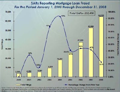
Mortgage Fraud Fillings on the rise

New data from the US Treasury's Financial Crimes Enforcement Network shows that fraud claims in the mortgage market rose in 2008. The absolute increase is unsurprising as the total number of filings has risen every year since 2000. More surprising is the rate of change of filings (the line graph in the figure below).

The chart shows that the largest percentage increase in filings was in 2003 and 2004, during the height of the housing bubble. The information should make us reconsider the argument that consumers were tricked by mortgage sellers into housing that they could not afford. At least the kind of massive fraud that Secretary Geithner commented upon back in March. Geithner's comments were about the incentives of financiers to engage in fraud a case that these numbers do not speak toward.

The data is only filings and as we learned when Harry Markopolos' repeated calls for Bernard Madoff to be investigated by the SEC reporting a suspected fraud doesn't mean that anyone is going to do though follow up. Even if firms were reported by a few savvy customers they may have continued to operate.

They may also have gotten more savvy themselves about not getting caught. This may explain the slow growth in fraud filings during the current crisis.

Thursday, July 2, 2009

Financial Sunset in California

I've got a piece today over at TCS Daily on the budget crisis in California. The state is set to begin issuing IOUs at 2pm Pacific time today. I conclude that CA's budget crisis could presage the likely outcomes for the US Federal government is nothing is done about spending, Social Security, or Medicare/Medicad costs.

I'll try to tweet updates on CA via www.twitter.com/apumich

Thursday, June 25, 2009

Subsidy Rate Falls in new CBO Report on TARP

In a report released today, the Congressional Budget Office (CBO) lowered it's estimate for the total subsidy rate for the Troubled Asset Relief Program (TARP). The new report, which assess TARP transactions through June 17 lowers the subsidy rate, a measure of the amount of total outlays that Treasury does not expect to recoup, to 36 percent from 45 percent in it's March baseline. 

The reduction reflects improved market conditions and quicker than expected TARP repayments, including a repurchase of almost $70 billion in warrants by 10 major institutions earlier this month. 

New aid to homeowners has a 100 percent subsidy rate, as that program does not require repayment to Treasury.

While the overall prospects are encouraging, the auto industry shows little promise of repaying it's "loans." With the exception of the foreclosure plan, the auto industry assistance, with a subsidy rate of 73 percent is the worst expected return of any part of TARP. The estimates follow closely previous, disaggregated auto industry assistance subsidy rates posted on this blog in January.

Wednesday, June 24, 2009

New Citi Plan could reduce risk

Citicorp announced plans to increase salaries today. The plan raised the ire of TARP oversight chairwoman Elizabeth Warren.
Yet Warren, who testified to House Financial Services today in defense of the administration’s proposed Consumer Financial Protection Agency, is misdirecting her anger.

As CNN reported today, the Citi plan is not to make its employees richer. Instead the plan swaps bonuses for salary. While it may be strange to most, almost two thirds of compensation for financial industry workers is not in their salary but rather in bonuses. Remember the “golden parachutes?” None of that money was salary.

So the plan is about redirecting the type of payment. Bonuses have been blamed for making traders more likely to take excessive risk and focus on short-term profit. Shifting to salary should reduce those incentives. The plan makes financial analyists more like other workers, and they think less about how their actions contribute to the profit margin in next quarter's report. While theory suggests that employers care most about total compensation, the Citi move indicates that the type of compensation really does impact incentives and should be considered in business decisions.

Friday, June 19, 2009

The Uninsured are Young Men

The chart above is from new data released today by the US Census Bureau. The chart shows the percentage of people by age and gender who are insured. Amidst disccusion of universal coverage through a possible health care mandate, the chart above reminds us that Americans do a very good job of obtaining health care coverage. Almost 85 percent of Americans have coverage.

Those least likey to have health care coverage are the young. Yet even among men aged 20 to 24, the group least likely to be covered, 69 percent have coverage. A successful mandate could increase coverage in this group by no more than 30 percent. While some young people may want health insurance and cannot presently afford it. Young people do face significnatly higher unemployment rates (the rate for men 20-24 was about 10 percent in 2008 and reached over 16 percent in the first quarter of 2009). Given that employers typically sponsor health plans, low labor force particiaption may be a barrier for some. Yet many likely see themselves as healthy and are willing to take a risk by not having health insurance.

Thos who support mandates are most likely to point to the right side of this chart and point out that mandates have worked for older Americans. The coverage rate jumps from the high eighties to almost one hundred percent at age 65, the Medicare claiming age. Yet a Meicare-like option, where younger workers help support fees for older workers though payroll taxes, cannot be replicated upon younger workers—there is no one younger to subsidize them.

Monday, June 15, 2009

As the US demands less, can the world demand more?

A report today by the IMF, concludes with an advisory that the US should not be counted upon to continue as the “global ‘buyer of last resort.’”

This claim is by no means new. Yet coming from a multi-national development institution that has long relied upon the United States to provide a bulk of its funding it takes on new urgency. In particular President Obama pledged a new $100 billion US contribution to the IMF earlier this year. (I commented on the implications of this injection for IMF voting in a previous post.)

Yet it’s unclear which, if any, country is ready to take upon the role the US played in driving global demand. The ideal candidate would be a large growing economy. Yet the biggest players have serious problems. China is known for its high personal savings rate. Plus, as CFR’s Brad Setser pointed out over the weekend much of the current growth in Chinese demand has been focused on domestic production, a trend that is likely to continue as long as the yuan is pegged to a basket of currencies in an attempt to encourage cheap exports.

India’s consumer economy may be more robust but like China it’s found domestic producers for a great many products. Indians may be beginning to drive but don’t expect to see many of them in Fords; they have Tata and other regional players.

When it comes to reliance on US demand, paraphrasing Churchill may be most helpful. It’s the worst system around, except that we have no other to try.

Sunday, June 14, 2009

Fearing the R-word

Among elected officials, there is rarely a desire to be the first to use the "R-word": Recession. While the word does not evoke the same fear of breadlines and shantytowns that Americans have been trained to associate with a Depression, the term still reminds people of slim times and cutting-back.

Friday the University of Michigan and Reuters released their headline confidence index: the Index of Consumer Sentiment. The measure tracks how people feel about the economy at any given time. The index sat at a
bout 80 points just before the current recession began in December of 2007. Since then it feel to a low of  55.3, a level unseen since 1980.

Confidence is beginning to recover, reaching 69 points in the preliminary June estimate. This good humor comes even as unemployment continues to rise and economists tell us that Americans have "lost their spirit."

Yet more interesting than the immediate swing in confidence is the increased variation when we do enter recessions. Beginning in the 1980s, peoples confidence became markedly different during recessions (as timed by the NBER) then during the rest of the business cycle.

The chart below gives the average level of consumer confidence by decade. It then provides decade-long averages for both recessionary and non-recessionary periods. Starting in the 1980s the gap in confidence between recessions and the rest of the business cycle becomes stark. While the current recession has been deep, the 1990's and even early 200s saw mild recessions associated with large deterioration in confidence. Consumers look more manic than they once did.

Source: Author's calculations, University of Michigan/Reuters Index of Consumer Sentiment, National Bureau of Economic Research Business Cycle Dating

Tuesday, June 9, 2009

Banks Stress Competitiveness in TARP Repayment

Treasury has announced that it will allow 10 institutions to payback $68 billion in funds obtained via TARP’s Capital Purchase Program (CPP). The move comes as the Administration mounts pressure to limit executive compensation. Last week, Kenneth Feinberg, the man who handled compensation for 9/11 victims' families was reported to be taking a position as a compensation czar. The Wall Street Journal reported the new position as "Special Master for Compensation."

In testimony today, Secretary Geithner said that TARP has been successful but is only one piece of the solution. While calling for a “delicate balance between intervention and allowing market participants latitude to operate,” Geithner did call for a new regulatory structure.

So it's not surprising that the Treasury release did not name the banks that are paying back the funds yet Bloomberg had no problem naming them. In fact, an excited release from JP Morgan Chase touts the firm’s “fortress balance sheet." Firms want everyone to know that they are getting out of TARP. Ironically, when the CPP launched Treasury quickly gave funds to lots of institutions, some who may not have needed it, to obscure the unhealthiest institutions. By the end of 2008, 214 institutions had funds and at present 601 disbursements have been made.

These institutions want both potential employees and investors to know that they are steady enough to get rid of the TARP funds but more importantly they want to signal that they can get out before Congress or the Administration imposes new rules and regulations.

Wednesday, June 3, 2009

Academics probe Twitter habits

A new study out of the Harvard Business School, takes a look at Twitter the newest, yet to make money, social networking craze. While the study finds some interesting gendered impacts (men are more likely to follow other men), I'm struck by the graphic below of how concentrated Twitter production is.

The study finds that 90 percent of tweets come from the top 10 percent of users. They compare this to 30 percent of content production by the same share of other social networks.


One possible explanation is that Twitter allows few types of content. Other networks like Myspace or Facebook allow posting of music, photos (which twitter does allow), or surveys. 
Twitter is also at a different stage of development than more mature networks.

Tuesday, June 2, 2009

New Markets are Urban Markets

This post should have gone up several days ago, fortunately the finding is evergreen.
Last week Treasury announced it's New Markets tax credit. The program provides $1.5 billion this year for community development and is funded through ARRA.
While the headline was the amount of money going out, the point that few noticed is how much of this community development is headed to urban areas.
Source: CDFI releases, author's calculations

The figure gives the share of the total disbursements. The data comes from individual allocations, which state the share of their funds going to each type of location. The clear tendency is to spend in urban areas. In fact of the 32 organizations that received funds only three intend to use more than 40 percent of their funds in urban areas. Of course this is only one part of ARRA.

Thursday, May 28, 2009

Give me the Bad News

This post is going to make a new economic forecast look a bit less hopeful. If you're looking for better news, I recommend that the reader link over The Good News Economist instead.

Yesterday, the National Association of Business Economists (NABE) released it's May economic outlook. The outlook predicts that the recession will end this year and that 2010 will see 2.7 percent growth (Q4 to Q4). Now NABE is not a group of bulls, they call the growth beginning this year a "subpar 1.2 percent rate in the second half."

The group gives a fair estimate. It just buries some of the information. When talking about 2010, the release says that growth "is slated for a return to near its historical trend." That's true growth in the high 2 to low 3 percent range has not been uncommon in the US of late. The problem is that we still had a recession, so while growth is back on trend the level of GDP remains off trend.

Taking a look at the rates predicted by NABE, one can produce the chart below (if you also pull in the BEA's GDP data).

I do assume that the 2.7 percent annualized rate is constant across quarters. This is not entirely realistic but if the 2.7 holds then shifting the quarter growth will likely only make the recovery happen more slowly. In either case until the third quarter of 2010, GDP is lower than it was when the recession began and by the end of 2010 growth since the beginning of the recession (according to NBER in December of 2007), is only .0456 percent.

Tuesday, May 26, 2009

A Picture is Worth a Third of your Housing Wealth

Thanks to Vincent Reinhart and Nick Schulz, we have a new spiral figure of the US home prices up at The American's Enterprise blog.

The new spiral shows that US home prices in 20 major urban areas are down 31.4 percent from their peak in May of 2006. This rapid decline follows the bubble in housing prices that drove the 20-city index to increase 74 percent between January 2000 and December 2005, data for available five year changes are below.


While, it may not make sense for home prices to remain flat over time, in fact longer time series show real growth, there may still be room for prices to continue falling. The supply of new homes is falling, which may help to stabilize the price over time.

Tuesday, May 19, 2009

Households seek less debt

A letter out of the Federal Reserve Bank of San Fransisco shows that American households are a lot like their banks, neither wants to be carrying much debt right now. The Federal Reserve Bank looked at the ratio of household debt to personal disposable income and found that since the recession began there has been a slight decline. From an all time high of 133 percent in 2007, the ratio now stands at 130 percent.

According the the report, "going forward it seems probable that many US households will reduce their debt." The report even finds that the US could face a situation similar to Japan in the 1990's and push the debt ratio below 100 percent. This all makes sense given that the most prominent avenue to wealth creation in the US his home ownership, which has seen rapid declines in value over the last year. As the New York Times reported in March, household wealth dropped about 9 percent in 2008. Yet house prices have fallen faster, almost 19 percent year over year in 2008 and 30 percent from their 2006 peak.

An honest deleveraging will require casting off much more debt. Of course, given that much of this is mortgage debt there is likely to be a long adjustment

Thursday, May 14, 2009

Investment Plummets says EU Release

A new release out of the European Union's Eurostat program today, provides a glimpse at how the global recession has impacted financial flows. A release today tells that foreign direct investment in the 27 EU member countries fell 60 percent last year. Investment from the US to the EU fell particularly hard to 45 bn euro in 2008 from 194 bn euro in 2007, down 76.8 percent. At the same time those 27 countries invested 30 percent in the rest of the world.

Of course this data represents corresponds to the freezing of credit markets last fall. Yet it may also indicate changes in long-term investment expectations. Foreign direct investment (FDI) is seperate from pure financial flows that includes a wider array of short-term investments in stocks, currency, etc. FDI focuses on "obtaining a lasting interest by the investor in one economy in an enterprise resident in another economy." The Eurostat release lists purchases that buy more than 10 percent of a firm's stock in this way. Think of Inbev's purchase of Anheuser-Busch.

These declines come just as President Obama seeks to change profit repatriation laws to reap more tax revenue. Criticism of the plan exists both at home and in EU countries like Ireland, which has been a beneficiary of American subsidiary profits to tax. If investment falls, the impact of such taxes changes may be less than everyone expects.

Wednesday, May 13, 2009

Treasury Doubles Down on Risk

Treasury Secretary Timothy Geithner is now finishing a speech to the Community Bankers of America. Full text here. He's just announced, to large applause, that the Treasury Department finds itself addicted to private lending.

Treasury plans to used the "proceeds of repayments we expect to receive from some of the largest banks" to allow banks with total assets of less than $500 million to re-apply to the Capital Purchase Program (CPP). The CPP, which is the bulk of the TARP funding, will now be going to small public and private corporations and mutual intuitions, among other types. This applies both to banks that have applied previously and new applicants. Treasury will also extend the deadline for small banks to form holding companies and re-apply to CPP for the next six months.

This move puts the returns gained from CPP back up for market risk. In addition is does so just as markets appear to be recovering and we should be encouraging private capital not flooding another round of government investment.

In his remarks Geithner stressed that these community banks, such as Farmers National which has $400 million ins assets and received $7.5 million from CPP were healthy before they received CPP. Treasury's lending too such can make a "viable bank stronger and ensure that it could lend more aggressively."

Yet we know that smaller institutions were low on the totem pole of CPP from the start. The largest amount of funds went to small number of institutions in a short time, as I've posted previously. CPP began about crisis management and that lending strategy made sense. Yet CPP is beginning to look more like industrial policy. In fact if Bank of America, the firm which according to the Fed's stress test needs to raise the most capital of the 19 banks tested has already found $7.4 billion of its required $34 billion in private capital, "viable" banks should be encouraged and able to raise private capital. In fact the stress test made such encouragement. Yet in his comments to small banks, Geithner make no calls for them to raise private capital.

Tuesday, May 12, 2009

"a" Gifts: Thoughts on the 2009 Trustees Report

Today, the Social Security Trustees released their annual report for 2009. It's an annual event that Meagan McArdle of The Atlantic referred to as "every journalist's favorite annual kabuki ritual."

 For those looking for the headline news, the Trustees have given the program a more bleak forecast than last year. The program is no expected to begin running deficits one year earlier, in 2017 and the Trust Fund will be exhausted four years earlier in 2034.

For those who don't want the wonkish titular explanation, please leave this post now and go read LOLFed (seriously, it's great). For the few of you left, a few thoughts.

1. Social Security "current law" crisis deniers are not putting their money on the table to support their assertions. Unlike the US general budget, the Trust Fund is accounted for seperately and only used for Social Security. In addition to taking in payroll taxes, and some intra-government transfers, the Trust Fund also accepts gifts. This year, even as Social Security turned 70, few gave. In fact the amount is a generic footnote in a table "a. $-.5 to $.5 million." Ouch. Especially since I think such gift programs could be successful at gauging public demand for government services if they were available more broadly in this line item fashion.

2.  There's no COLA, and no need for a COLA. Get over the COLA
When it comes to pop, we all know there are healthier beverage options but flavored sugar water is always tempting and ultimately unsatisfying. It's the same with COLAs (Cost-of-Living Adjustments). There be no COLAs until at least 2013 since inflation is expected to remain low.  When I say 'expected' I mean by government agencies like CBO who believe that the Fed can quickly unwind toxic, uh "legacy assets." For an alternative inflation outlook see Alan Meltzer.

Yet the National Committee to Preserve Social Security and Medicare (NCPSSM) says we need to ensure that everyone gets a COLA. I agree with NCPSSM that retirees do have a consumption basket skewed toward higher health spending. I'd also like to know that those same seniors draw on Social Security and the other program NCPSSM wants to protect. Currently, these programs serve most retirees well.